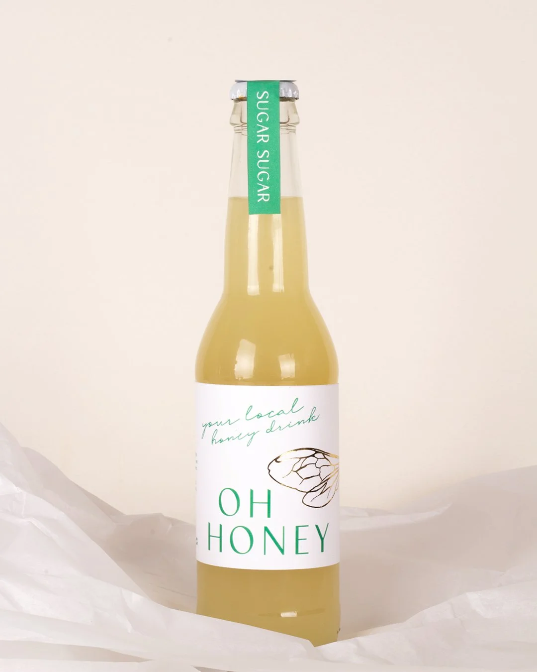
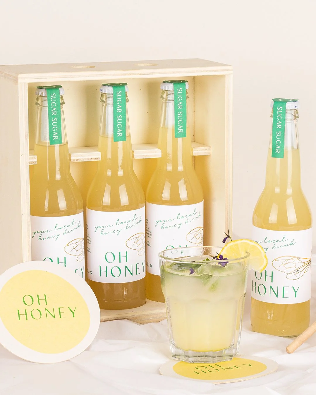
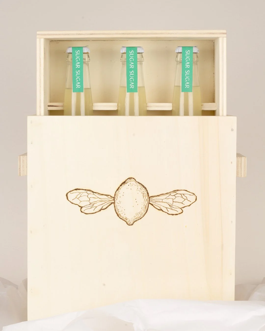
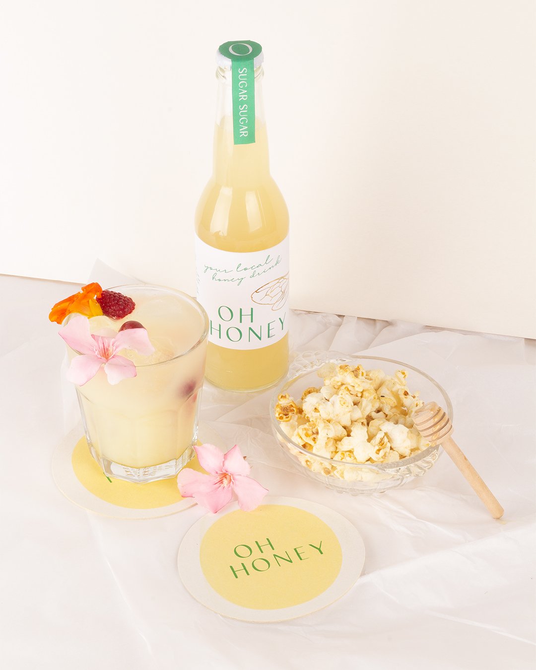
For Oh Honey, we translated the freshness of nature into a refined packaging design that instantly draws the eye. Subtle gold foil details in the bee wings catch the light and add a soft, elegant touch. The minimal label, built with delicate illustrations, creates a light and dreamy atmosphere. The result is a cohesive visual story that feels pure and fresh.


SERVICES

DESIGNERBRIEF

CLIENT

CONCEPT DESIGN
ILLUSTRATION
BRAND IDENTITY
PRINT DESIGN
PACKAGING
PHOTOGRAPHY

lemonade packaging with minimal label design, delicate line illustrations and subtle gold foil bee wing details, styled with soft, natural photography
Previous
Previous

SMASHED

Next
Next

Designregio Kortrijk